
Overlay blue

Tamkeen

Shopping experience optimization

Tamkeen is a large-scale e-commerce platform. I led the full UX optimization and redesign process, focusing on removing friction and enhancing the core shopping experience.
Conversion Optimization
Mobile UX
Product Discovery
Navigation Redesign
Responsive Design
Brand Consistency
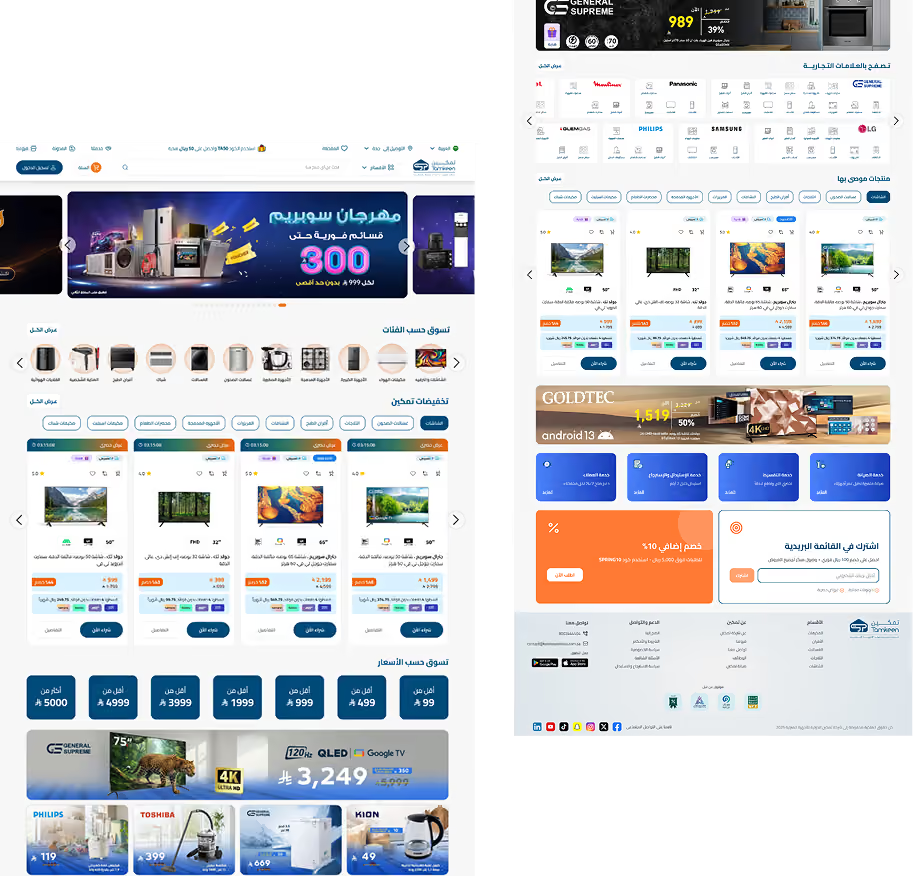
E-commerce website homepage in Arabic showing electronics, home appliances, TVs, and discounts.
Role
UX/UI Designer
Duration
11 Months
Duration
11 Months
Tools
Figma, MS Clarity
Sector
B2C /  E-commerce

Project overview

gradient stroke

Tamkeen serves a high-volume retail audience. This project focused on transforming a content-heavy experience into a decision-friendly shopping flow.
Tamkeen logo with Arabic text and tagline on a blue background.

Business challenge

Despite high traffic, users were not engaging deeply. Major issues included: Weak conversion rate, High bounce rate, Low scroll depth. Especially in the hero section included 5 rotating promotional banners, creating strong visual competition and user distraction.

chart down icon
Weak conversion
High drop-off rates at critical journey points.
outline log out icon
High bounce
Users leaving immediately due to visual clutter.
mouse scroll icon
Low scroll depth
Failure to engage with content below the fold.
navigation compass icon
Poor navigation
Unclear structure slows product discovery.
mobile phone icon
Weak mobile UX
Crowded layouts slow usability and interaction.
organization line icon
Flawed hierarchy
Competing banners reduce focus and clarity.
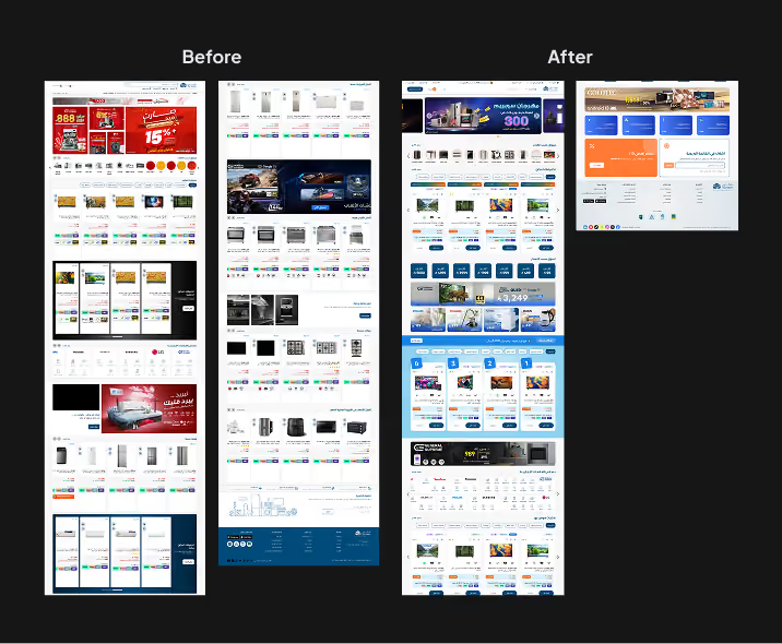
Side-by-side screenshots comparing an Arabic e-commerce website before and after a redesign with updated layout.

My process

Horizontal wavy white connecting line with circular nodes on gray background.
1. Research
Understanding user behaviors through Clarity and heatmap analysis.
2. Diagnose
Identifying friction points in product discovery and navigation.
3. Strategize
Defining a focused shopping journey and conversion goals.
4. Design
Creating a simplified hero section, product cards, and filter UX.
1. Research
Understanding user behaviors through Clarity and heatmap analysis.
2. Diagnose
Identifying friction points in product discovery and navigation.
3. Strategize
Defining a focused shopping journey and conversion goals.
4. Design
Creating a simplified hero section, product cards, and filter UX.
Black thin line with evenly spaced small circles along its length on a transparent background.
5. Validate
Testing mobile navigation and responsiveness across devices.
6. Deliver
Final handoff of the design system and optimized flows.
Abstract wavy pink and purple gradient background with connecting light blue curved lines
4. Design
Creating a simplified hero section, product cards, and filter UX.
5. Validate
Testing mobile navigation and responsiveness across devices.
6. Deliver
Final handoff of the design system and optimized flows.
5. Validate
Testing mobile navigation and responsiveness across devices.
6. Deliver
Final handoff of the design system and optimized flows.

UX improvements

gradient stroke
1. Homepage
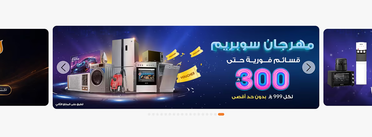
The homepage had too much visual noise. I simplified the hero to focus on primary calls to action, removing redundant banners that caused choice paralysis.
Home appliances including fridge, oven, washer, and vacuum with Arabic text and discount promotion.
2. Product card
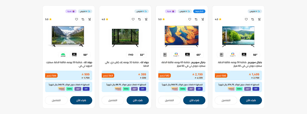
Product cards were dense. I restructured information hierarchy, emphasizing price and product imagery while moving secondary specifications to detail pages.
Online store display of four smart TVs with specs, ratings, prices, discounts, and purchase buttons in Arabic.
3. Grid view / List view
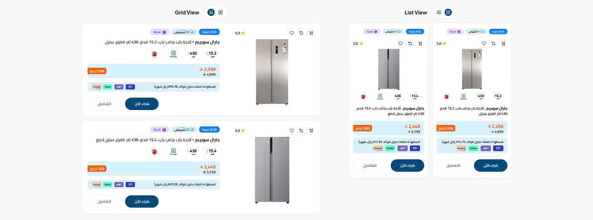
Users needed more flexibility when browsing products. I introduced grid and list views for quick scanning, allowing users to switch based on contentdensity and browsing intent.
Comparison of refrigerators shown in grid and list views with prices, ratings, and key features in Arabic.
4. Filter experience
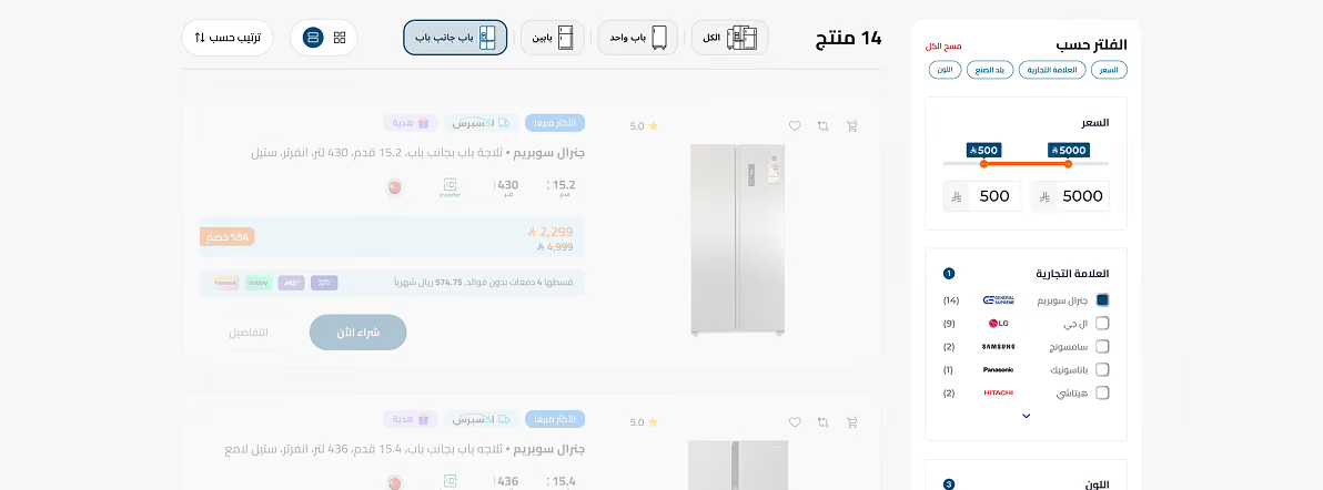
The filtering system caused confusion. I restructured filters into clear groups, added visible applied states, and enabled instant results updates to improve confidence.
Arabic e-commerce page showing side-by-side fridge listings with price filter and brand checkboxes.
5. Navigation
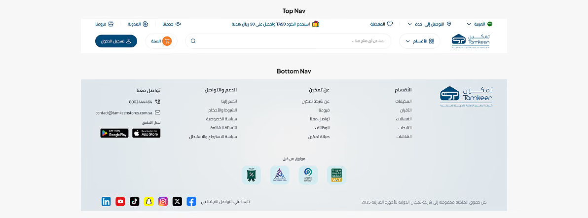
Navigation lacked clarity and created friction. I reorganized links into clear groups and improved hierarchy, making it easier for users to scan and find key sections.
Arabic website navigation menu with top search bar, login, cart, and bottom footer with contact info and social icons.

Responsive UI

I redesigned the homepage and category flows across desktop and mobile, introducing subcategories and improving navigation, usability, and touch interactions.
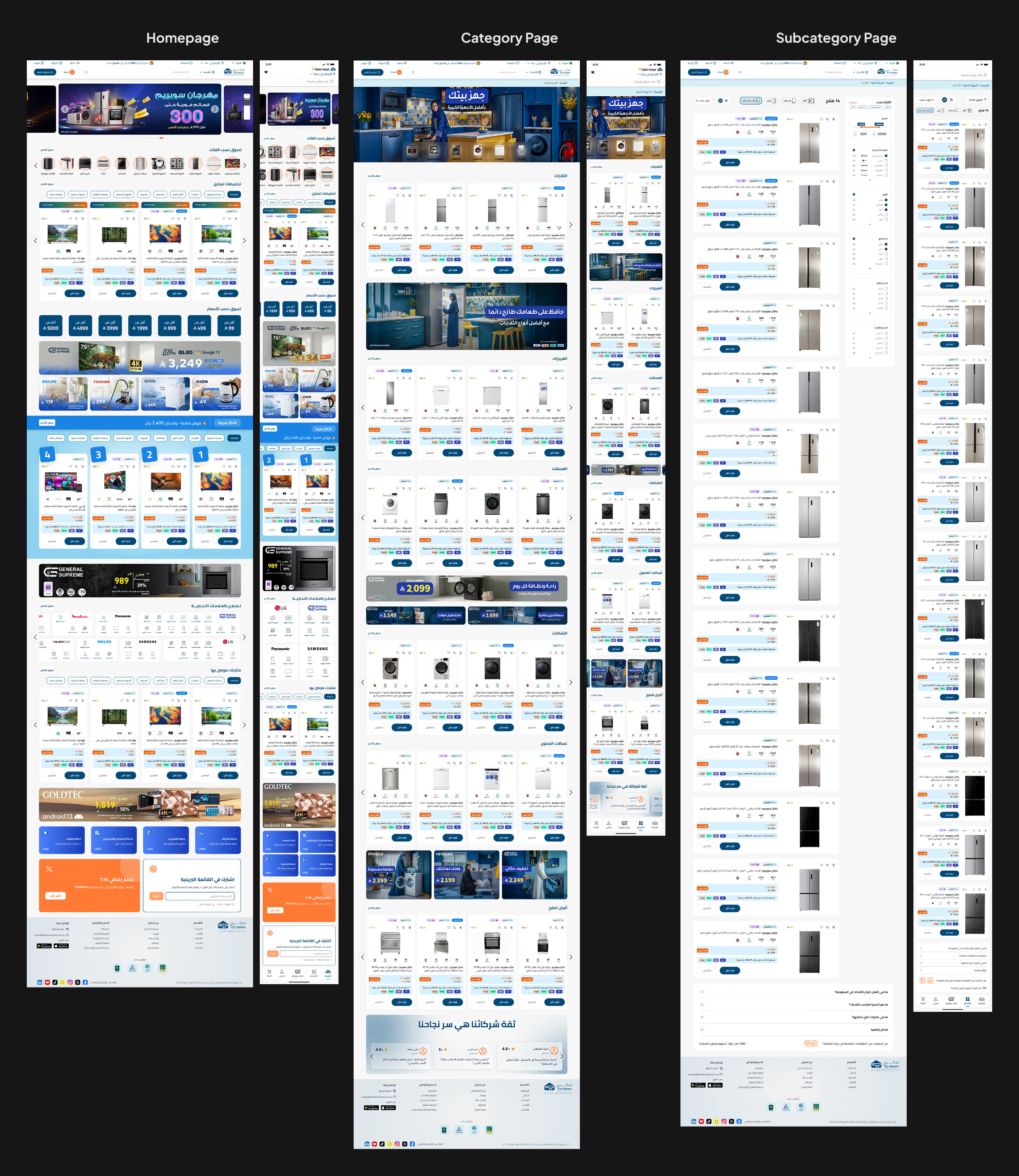
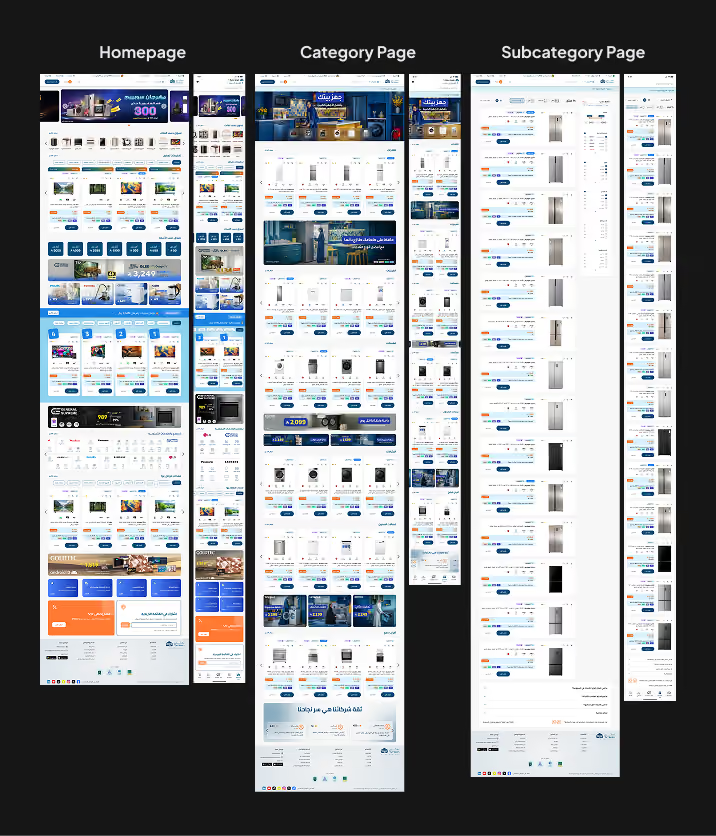
Responsive e-commerce site pages showing homepage, category, and subcategory layouts with product listings in Arabic.Responsive e-commerce site pages showing homepage, category, and subcategory layouts with product listings in Arabic.

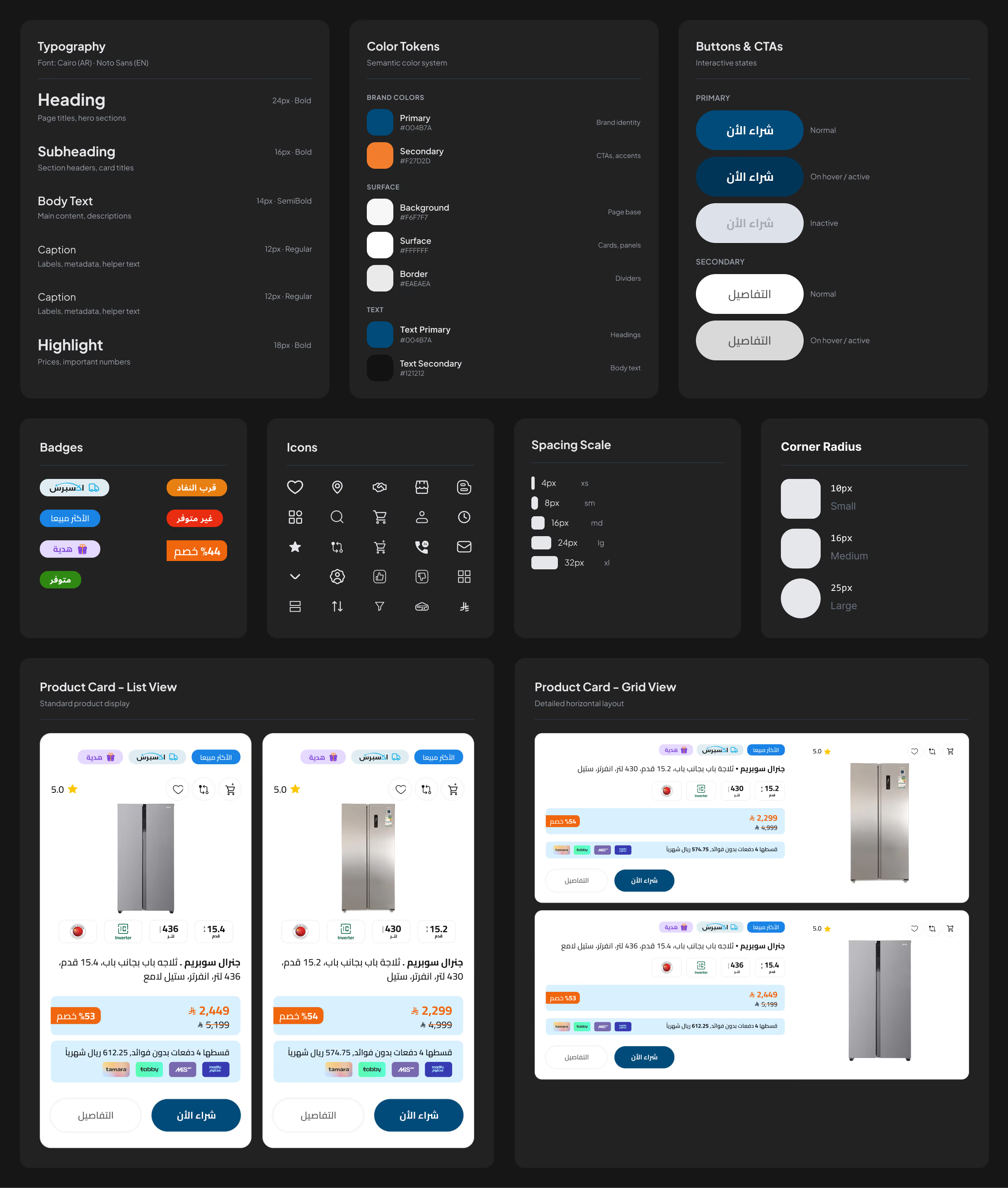
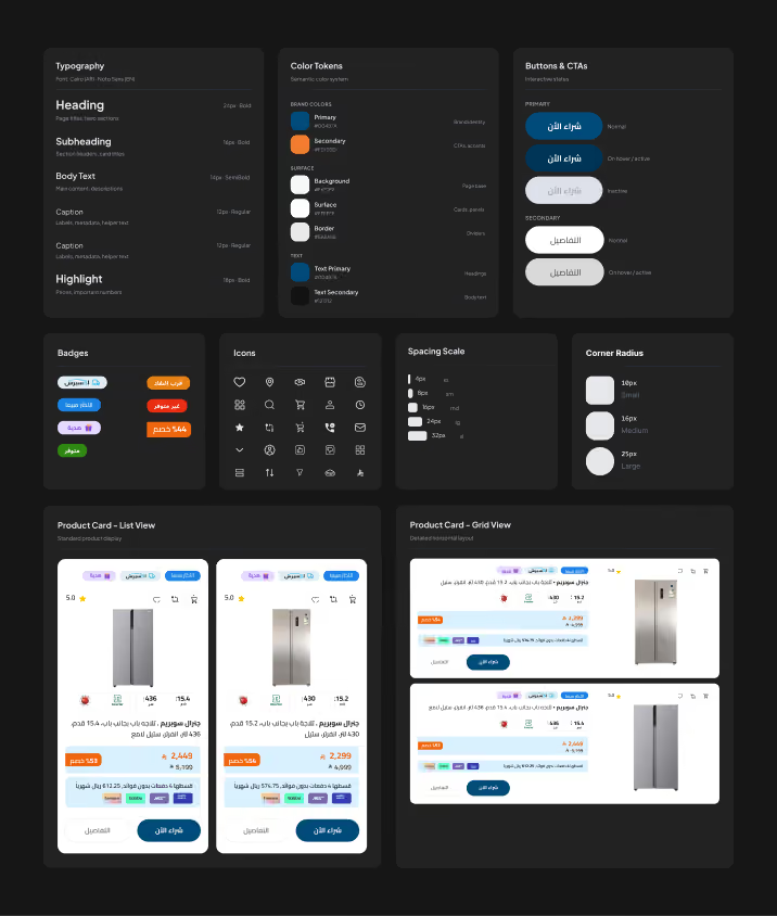
Sticker sheet

UI design system showing typography, color tokens, buttons, badges, icons, spacing, corner radius, and product cards.UI design system showing typography, color tokens, buttons, badges, icons, spacing, corner radius, and product cards.

Business impact

The redesign improved both usability and business performance.

Key outcomes included:
Better Conversion
Lower Bounce
Deeper Scrolling
Better Discovery
Mobile Optimized
Higher Visibility
Better Engagement
Better consistency
Conversion rate improved
Bounce rate reduced
Scroll depth increased
Product discovery improved
Mobile usability improved
Product visibility increased
Shopping engagement increased
UX consistency improved
Key insight
Clearer experiences led to faster decisions, improving both user satisfaction and business performance.

Reflection

Key insights
01
Conversion issues often stem from attention and clarity, not lack of content, helping users focus better and take action faster.
02
Reducing friction is more effective than adding more promotions or information, simplifying the experience and improving decisions.
03
Clear structure and focused content help users make faster decisions, improving usability and overall experience flow.
Growth
Tamkeen strengthened my product thinking, stakeholder management, and business-driven UX decisions.
It became one of the strongest examples of how UX directlyimpacts business performance.